Redesign Poster
Redesign Poster
Redesign Poster
Transform traditional dentist posters into charming, hand-drawn illustrations.
Transform traditional dentist posters into charming, hand-drawn illustrations.
Transform traditional dentist posters into charming, hand-drawn illustrations.


The original poster
The original poster
The original poster
My Role
UI Designer
Project
Self-initated
Timeline
a day (2023)
Tools Used
Photoshop
My Role
UI Designer
Project
Self-initated
Timeline
a day (2023)
Tools Used
Photoshop
Design Flaws:
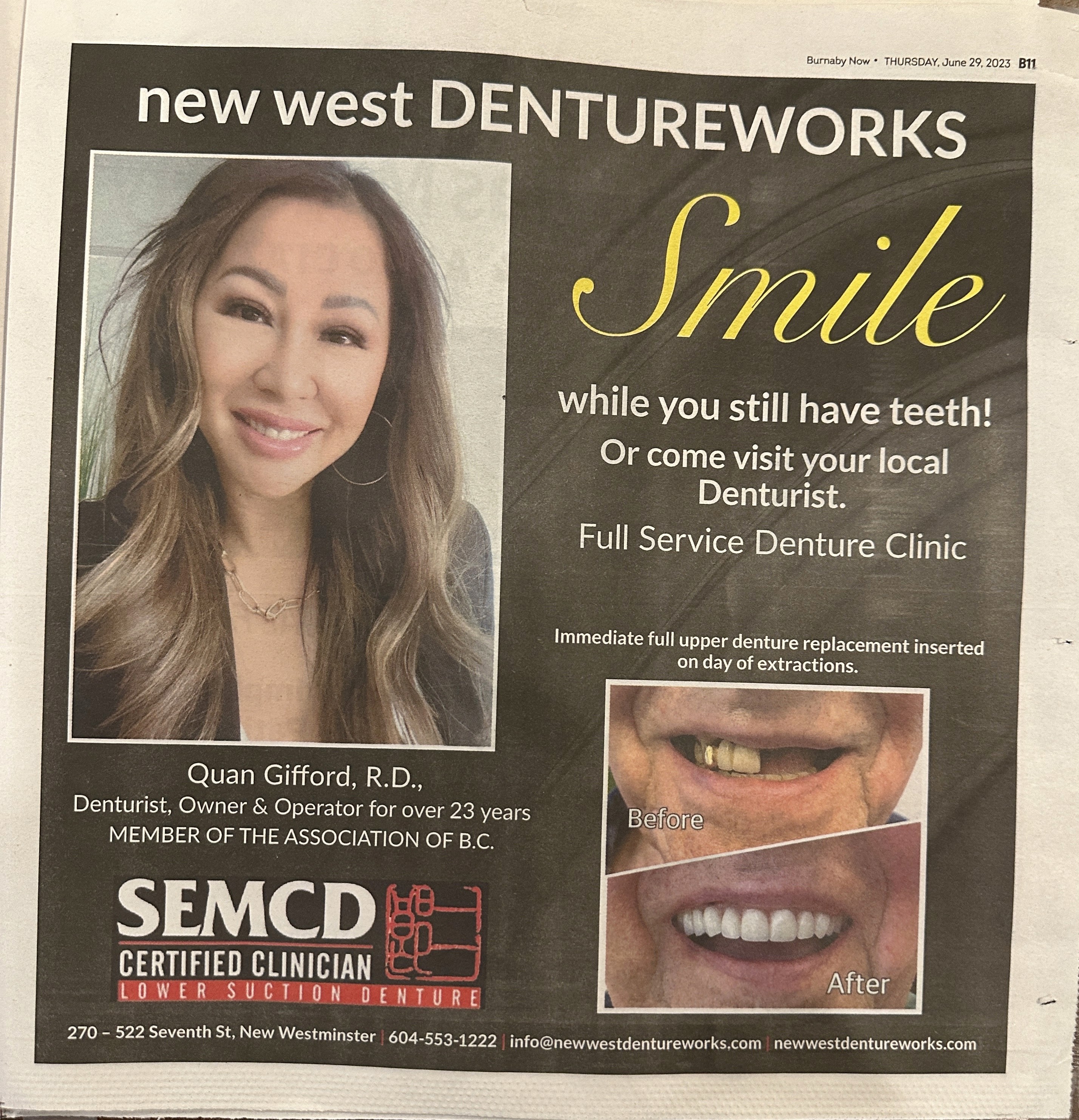
Visual Clutter: The original poster has a lot of text and multiple images, creating a visually cluttered layout that can overwhelm viewers.
Lack of Visual Hierarchy: The information is not well-organized, making it difficult for viewers to quickly grasp the key messages. Important elements do not stand out.
Uninspiring Imagery: The use of generic and somewhat clinical imagery does not evoke a sense of warmth or approachability, which is crucial for a dental service.
Typography Issues: The choice of fonts lacks cohesion, and the text sizes and styles do not guide the viewer's eye effectively.
Color Scheme: The color palette is not particularly inviting or comforting, which is essential for reducing anxiety associated with dental visits.
Description:
Description:
Description:
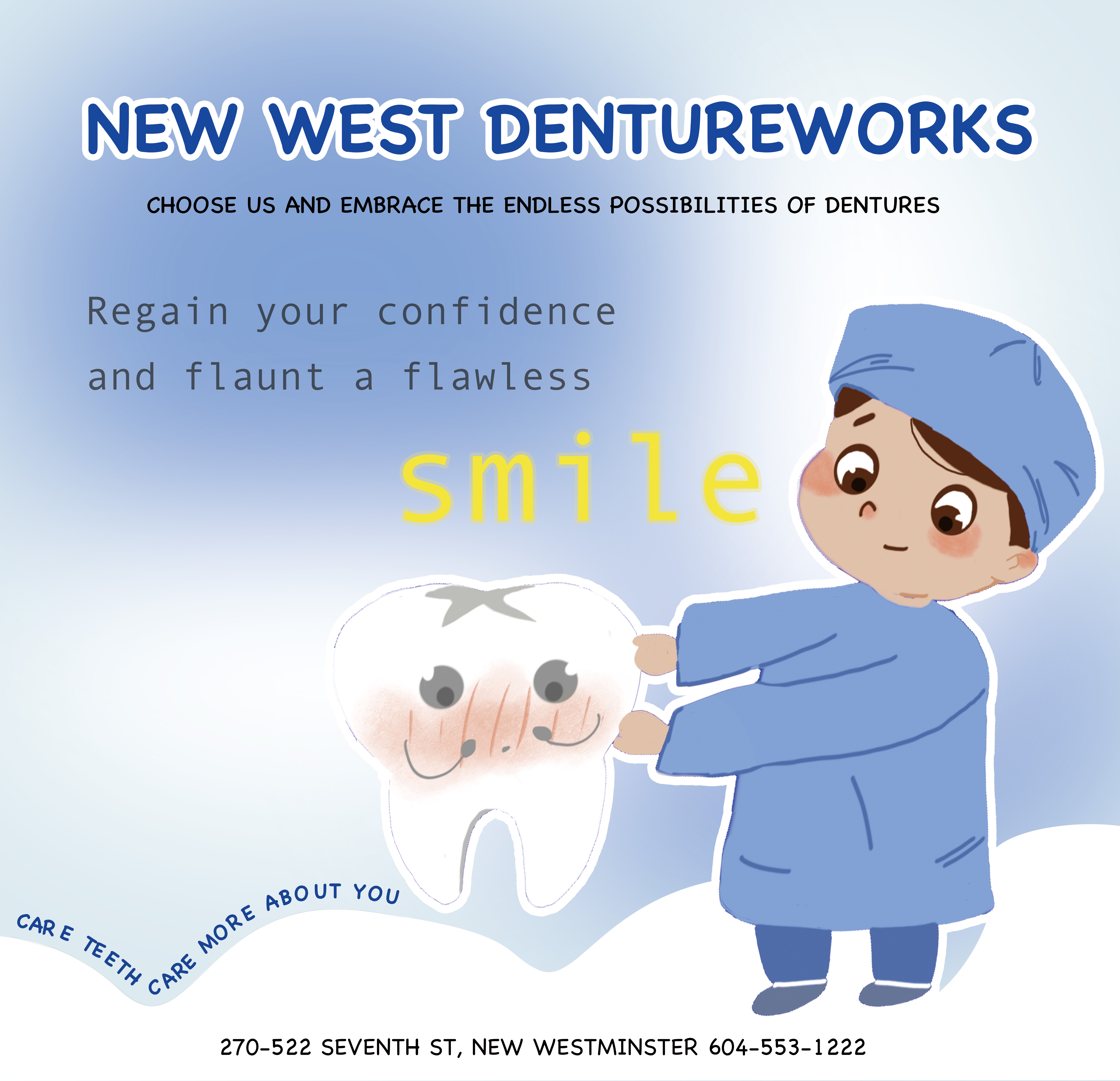
The redesign of New West Dentureworks posters features adorable hand-drawn characters and a soft color palette, creating a welcoming and friendly atmosphere. This approach aims to alleviate the anxiety associated with dental visits and highlights the positive impact of dentures on confidence and smiles.
The redesign of New West Dentureworks posters features adorable hand-drawn characters and a soft color palette, creating a welcoming and friendly atmosphere. This approach aims to alleviate the anxiety associated with dental visits and highlights the positive impact of dentures on confidence and smiles.
The redesign of New West Dentureworks posters features adorable hand-drawn characters and a soft color palette, creating a welcoming and friendly atmosphere. This approach aims to alleviate the anxiety associated with dental visits and highlights the positive impact of dentures on confidence and smiles.